


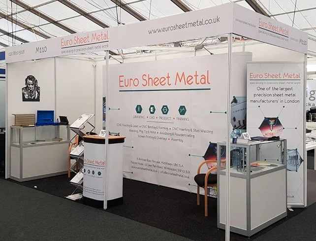
Trade shows remain a powerful platform for businesses aiming to present their brand in a competitive environment. The challenge lies in making a lasting impression within a limited booth structure. Shell scheme setups offer a standardised format, but success depends heavily on the visual impact of your display. Thoughtfully designed graphics can transform a basic space into a compelling brand showcase, ensuring your message is clear, professional, and visually appealing to passing visitors.
Understanding Shell Scheme Booths
Shell scheme booths are modular exhibition spaces typically made with aluminium frames and panel infills. These structures are widely used because they are cost-effective and easy to install. However, they also come with limitations in size, shape, and flexibility.
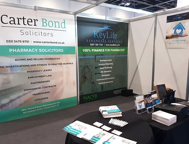
The graphics applied to these panels play a central role in defining the booth’s visual appeal. Without effective design, even the most well-known brand can appear unremarkable. This makes planning and creativity essential when working within a predefined structure.
Setting Clear Objectives for Your Design
Before starting any design work, clarity of purpose is essential. Every visual element should serve a goal.
Key considerations include the following:
- What message should visitors remember?
- Who is the intended audience?
- What action should visitors take after seeing your booth?
When objectives are clearly defined, the design becomes more focused. Instead of cluttered visuals, you achieve a streamlined presentation that communicates efficiently, much like well-planned bespoke exhibition stands that prioritise clarity and purpose.
Planning Your Layout Strategically
A well-structured layout ensures your graphics are easy to read and visually engaging.
Key layout principles:
- Top section: Brand name or logo for visibility from a distance
- Middle section: Core message or value proposition
- Lower section: Supporting details or contact information
Visual hierarchy is crucial. Visitors often glance quickly, so the most important information must be positioned at eye level. Avoid placing key messages too low or too high, as they may go unnoticed.
Choosing the Right Colours and Typography
Colour and typography directly influence how your brand is perceived.
Important factors to consider:
- Use colours that align with your brand identity
- Ensure strong contrast between text and background
- Avoid overly complex fonts
Typography should be bold and legible from a distance. Sans-serif fonts often work best in exhibition environments. Limiting the number of fonts keeps the design clean and professional.
Creating High-Impact Visual Content
Visuals are often the first element that captures attention. Strong imagery can communicate your message faster than text.
Best practices:
- Use high-resolution images
- Focus on one main visual rather than multiple competing elements
- Keep text concise and impactful
A simple, bold headline combined with a striking image creates immediate engagement. This approach works particularly well in shell scheme graphics, where space is limited.
Material Selection and Print Quality
The material used for your graphics affects both appearance and durability.
| Material Type | Advantages | Considerations |
| Fabric | Smooth finish, reduces glare | Slightly higher cost |
| Vinyl | Durable and cost-effective | Can reflect light |
Lighting conditions within exhibition halls can vary, so choosing materials that minimise glare ensures your graphics remain visible at all times.
Aligning Graphics with Brand Identity
Consistency is key to building recognition. Every element of your display should reflect your brand.
Elements to align:
- Logo placement
- Colour palette
- Tone of messaging
Avoid mixing different styles or inconsistent messaging. A unified design creates a professional appearance and strengthens brand recall.
Avoiding Common Design Mistakes
Even well-intentioned designs can fail if common pitfalls are not addressed.
Mistakes to avoid:
- Overcrowding the space with too much information
- Using low-resolution images
- Ignoring readability from a distance
- Weak or missing call-to-action
Keeping the design simple and focused ensures clarity. Visitors should understand your offering within seconds.
Integrating Graphics with Exhibition Elements
Graphics should not exist in isolation. They must work seamlessly with other elements of your booth.
Consider the following:
- Furniture placement should not block key visuals
- Lighting should highlight important areas
- Pathways should guide visitor movement naturally
When all components work together, the booth feels cohesive and inviting.
When to Consider Custom Solutions
While standard setups are practical, there are situations where upgrading becomes beneficial.
Comparing options:
| Feature | Shell Scheme | Bespoke Exhibition Stands |
| Flexibility | Limited | Highly customisable |
| Cost | Lower | Higher investment |
| Brand Impact | Moderate | Strong visual impact |
Businesses looking to stand out in competitive exhibitions often move towards bespoke exhibition stands. These allow complete creative control, enabling unique layouts and immersive brand experiences.However, even within standard booths, carefully planned shell scheme graphics can still deliver strong results when executed effectively.
Conclusion
Designing effective exhibition graphics requires a balance between creativity and strategy. A structured approach ensures that every element serves a purpose, from layout and colour choices to messaging and materials. While standard booths may have limitations, thoughtful design can maximise their impact. Investing in quality visuals not only attracts attention but also reinforces brand credibility. For businesses aiming to elevate their presence further, working with experts like Sign Company London can provide tailored solutions that align perfectly with exhibition goals.