


In the world of interior design, IKEA has achieved a rare feat: democratizing high-end kitchen aesthetics. However, the “secret sauce” isn’t just in the flat-pack boxes—it’s in the strategic methodology designers use to turn those boxes into a cohesive, expensive-looking space.
Here is how IKEA kitchen designers bridge the gap between “warehouse furniture” and “architectural showpiece.”
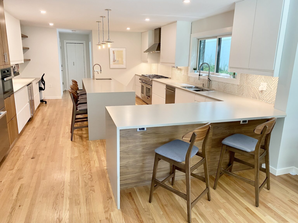
1. The “Custom” Illusion through Symmetry
IKEA kitchen designers rarely just “fit” cabinets into a space. They prioritize visual balance. A common trick to make a modular kitchen look custom-built is to center the main features:
- The Centerpiece: Designers will often center the cooktop or the sink on a wall and work outward with identical cabinet widths on either side (e.g., a 30-inch cabinet flanked by two 15-inch cabinets).
- The Crown Molding Hack: By using “deco strips” at the top of wall cabinets and adding a small gap filled with matching panels, they create a seamless transition to the ceiling, mimicking bespoke cabinetry.
2. Maximizing the “Vertical Footprint”
While standard kitchens leave a gap between the top of the cabinet and the ceiling, IKEA pros use the SEKTION system to its full vertical potential.
- Double-Stacking: They often stack a 40-inch cabinet with a 15-inch “over-fridge” cabinet on top.
- Integrated Appliances: Designers use “appliance garages” or hidden microwave cabinets to keep counters clear, making a small layout feel significantly larger and more “styled.”
3. High-Low Material Mixing
The most stylish IKEA kitchens often aren’t 100% IKEA. Designers use a “High-Low” strategy to elevate the base materials:
- The 70/30 Rule: Use IKEA for the “bones” (the cabinet boxes and internal organizers) but invest in third-party elements for the touchpoints.
- Upgraded Hardware: Replacing standard IKEA handles with heavy brass, matte black, or leather pulls immediately changes the “tax bracket” of the kitchen.
- Stone Tops: Designers often steer clients toward natural stone or high-end quartz countertops rather than laminate, as the counter is the most visible surface in the room.
4. The “Internal Architecture” of Function
A kitchen can look like a magazine cover, but if you can’t find the garlic press, it’s a failure. Designers use tiered storage to ensure every square inch is functional:
| Feature | Design Purpose |
| MAXIMERA Drawers | Pull-out systems that allow 100% visibility of contents. |
| Hidden Drawers | A “drawer-within-a-drawer” that maintains a sleek exterior line. |
| Corner Carousels | UTRUSTA pull-outs that turn “dead corners” into prime storage. |
| Plinth Drawers | Utilizing the 4.5-inch toe-kick space for flat items like baking sheets. |
5. Lighting as a Design Tool
A major secret to a “designer” look is integrated lighting. IKEA pros never rely on just a single ceiling light. They layer the light:
- Under-cabinet strips: To illuminate the workspace (Task).
- In-drawer lights: For a luxury “boutique” feel (Functional).
- Glass-door backlighting: To create depth and warmth (Mood).
6. The “Cover Panel” Finishing Touch
The biggest giveaway of a DIY kitchen is exposed “white box” sides. Designers use cover panels (extra sheets of door material) to “skin” every exposed side of a cabinet, the bottom of wall units, and even the sides of the refrigerator. This creates a “wrapped” look that feels intentional and architectural.
Pro Tip: The “Work Zone” Flow
Instead of just a triangle, IKEA designers plan for Zones:
- Zone A (Prep): Trash, sink, and compost all within one step of each other.
- Zone B (Cooking): Spices and oils in slim 10-inch pull-outs next to the range.
- Zone C (Cleaning): Dishwasher positioned so it can be open while you still have access to the “put-away” cabinets.