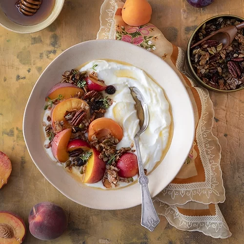
Color is one of the most important aspects of food photography. The right colors can enhance the visual appeal of a dish, evoke emotions, and even stimulate appetite. Whether you are a food blogger photographer looking to improve your images or a professional food photographer aiming to create mouth-watering visuals, understanding how color works can make a huge difference. In this post, we’ll explore how you can harness the power of color in food photography to create vibrant and eye-catching images that captivate your audience.
Why Color Matters in Food Photography
The colors in your photos can influence how the viewer perceives the food. They play a vital role in making food look fresh, inviting, and even delicious. For example, bright colors like red and yellow are known to stimulate appetite, while cooler tones like blue and green often create a calming effect. As a professional food photographer, mastering the use of color will not only help your photos stand out but also help convey the right mood and message to your audience.
When creating images for a food blog or professional purposes, color can turn a simple plate of food into a work of art. Understanding the emotional and psychological impact of color is crucial. The right color palette can make a dish look more delicious, while poor choices may make it appear dull or unappealing.
Key Tips for Using Color in Food Photography
Here are some actionable tips that can help you make the most of color in your food photography:
- Use Natural Light to Enhance Colors
Natural light has the ability to bring out the true vibrancy of food. It helps in making the colors pop without distorting the natural hues. If you’re working indoors, try shooting near a window to take advantage of the best natural light. As a Food Blogger Photographer, experimenting with different times of day will give you a variety of lighting effects to choose from.
- Create Contrast
Contrast is one of the best ways to make the colors in your photos stand out. For instance, placing a colorful dish on a neutral-colored plate or surface can make the food appear more vibrant. Dark backgrounds paired with brightly colored food, like a bright red tomato on a dark slate plate, help create a striking visual contrast that draws the viewer’s attention to the food.
- Understand Color Combinations
Choosing the right color combinations can enhance the mood of your food photography. For example, pairing greens and yellows can evoke freshness and healthiness, while reds and oranges can make the food appear more indulgent. Think about the story you want your image to tell and choose colors that align with that theme.
- Use Props to Complement the Food
Props such as napkins, cutlery, and table settings can complement your dish’s colors. When used correctly, these props can enhance the color palette of your photo without taking attention away from the food itself. Learning how to style your food with the right props will add depth and personality to your image.
- Stay Consistent with Your Color Scheme
For food bloggers and photographers alike, consistency is key. If you are building a brand or a food blog, using a consistent color palette across your images will make your photos instantly recognizable. Consider using a filter or preset to maintain a similar tone in all your photos, whether you’re showcasing vibrant fruits or rich, decadent desserts.
- Embrace Bold and Unexpected Colors
Sometimes, using bold or unexpected colors can help your food photography stand out. Think of vibrant garnishes, exotic ingredients, or even colorful backdrops that break away from the typical neutral palette. A pop of unexpected color can draw attention and add an element of surprise to your photos.
- Avoid Overwhelming the Viewer
While color is important, too much of it can overwhelm the viewer and distract from the main subject – the food. Ensure that the colors you use work harmoniously together. The goal is to enhance the food’s natural beauty, not overshadow it with clashing hues.
The Emotional Impact of Color in Food Photography
Color can also trigger specific emotional responses from your audience. Warm colors like red, orange, and yellow can make food look more appetizing and can even increase hunger. These colors are often associated with energy, warmth, and stimulation, which is why they are commonly used in food photography. On the other hand, cooler tones such as blue and green are often seen as calming and refreshing but may not always stimulate appetite in the same way.
When styling your food for a photoshoot, it’s important to consider what kind of feeling you want to evoke. For example, a dessert shot might look best with warm, inviting tones, while a salad may look fresher and more appealing with cool tones that highlight the vibrant greens.
Bringing It All Together: Color Is Your Secret Weapon
By understanding the role of color and using it strategically in your food photography, you can elevate your images from simple snapshots to professional-looking works of art. Whether you are a food blogger photographer or a seasoned professional, the tips shared above can help you create more dynamic, engaging, and mouth-watering food photos.
Remember to consider how lighting, contrast, props, and color combinations can influence the result. By being mindful of color choices and how they interact, you can create stunning visuals that not only capture the food’s natural beauty but also resonate with your audience on an emotional level.
For stunning food photography that truly stands out, Slade Photo is here to help you capture the perfect image with the right color palette, lighting, and styling. Let your food photos shine!

