Optimizing your product page comes as one of the most important tasks when you erect an e-commerce store. It holds immeasurable importance in the sales funnel and makes one of the key determinants in the conversion process. Product pages are the gateways to your sales and without proper optimization, you cannot expect to convert a potential customer. While it may have worked for some online merchants when Google cutting slack on its online metrics, with the new algorithms it now controls many factors that define your page rankings, user experience, and analytics. In this article, we will share 6 key design points that you need to integrate to optimize your product page and scale up your conversion rate.
1. Balance Elements with White Spacing
White spacing, also known as Negative spacing, is a graphical aspect of your page design. It is the empty space that separates many textual and visual elements on your page that work in harmony to engage, retain, and convert your target customer. white spacing plays a central role in organizing your page structure and improves the prominence of your key elements that you want your customer to focus on. This makes them more intractable, legible and enticing. This works particularly well when you have strategically placed CTAs on your product page or have any special offers that need attention. Adding this design feature to your product pages will not only promote balance but also increase the appeal of your content.
2. Enhance Navigation
Navigation is another significant design aspect that plays a part in the conversion flow. Sadly, many online merchants neglect this crucial aspect in their design optimization phase. Navigation features such as breadcrumbs, search filters, and local navigation categories help streamline your product page appearance, improve the accuracy in finding content, make searching more efficient and improves overall customer user experience. However, these elements hugely rely on the size of your product page, user behavior, and your conversion goals. In the example below, FMEextensions a leading Magento extension development company managed to improve its conversion rate by 16% just by implementing some local navigation elements.

3. Use Above the Fold Methodology
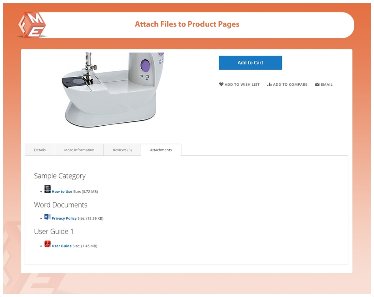
Your content is only as good as its first impression. But making it, that has remained a challenge for website owners since the birth of modern e-commerce. Customers are always inclined to get the most valuable insights first, save their time and get the deal done. This is where Above the Fold methodology comes to play. Above the fold design focuses on getting your most important, content and graphical elements on the starting section of the product page, giving customers the crux of your marketing pitch that contains unique selling propositions to entice customers. Implementing above the fold technique sets the stage for better engagement since customers get what they are looking for as soon as they land on the page. you can also attach files on the top section through product attachments by FMEextensions so customers can download essential files, guides, manuals, images, and other important documents regarding the product. This results in increased conversion rate and better user experience.

4. Strategic Placement of CTAs
CTA’s shortened for Call to Actions are intractable graphical elements used for prompting action from customers. These are not just clickable buttons, but form an integral part of the product page design as well. CTAs help you define your conversion goals, complete your content tone, capture your customers’ interest and simplify your sales pitch. Using them strategically in your product pages can yield amazing conversion results with much higher sales success. Moreover, combining them with other content elements has shown a substantial increase in conversion performance. According to a survey collected from several leading websites, CTA combined with a video recorded a 380% increase in clicks.
5. Improve Your Product Images
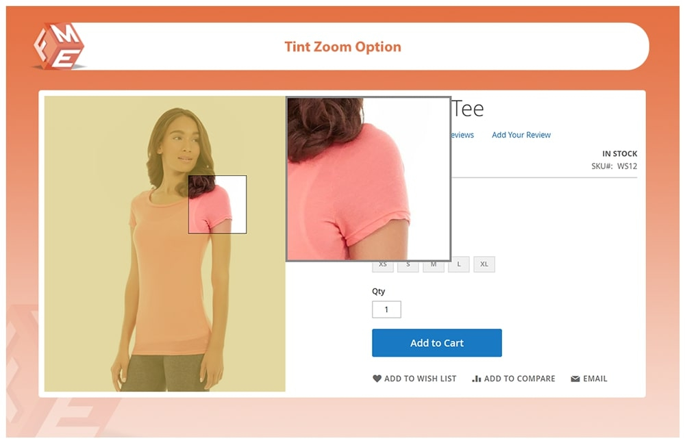
According to science, the brain processes images 600,000 times faster than text and retains their memory far longer than textual information. If content is the blood flow of your product pages, product images are the muscles that retain it. For many online merchants, product pages hold trivial importance that can be replaced or supplemented with textual content or other graphical fixtures. That is an absolute misconception. Product images convey details that no other element can. They substitute the closest experience of in-store shopping and ensure the product matches the customers’ expectations. Creating a good selection of product images and organizing them through Magento 2 gallery extension can communicate your product value and unique features to the customer, give your product pages the competitive edge they need to produce sales, and boost your brand image by telegraphing its style and appeal. To further captivate your customers, you can add product image zoom extension to magnify the image so customers can view the unique details of your products.

6. Add Live Chat Feature
Live chat is one of the most underrated aspects of product page design. Although live chat serves a more functional purpose than aesthetic, its importance in complimenting different page design elements is unprecedented. For many e-commerce vendors, live chat is only necessary for products or services that require special details. However, having a live chat nowadays is imperative to your product page even if you are selling unsophisticated products. Having live chat feature engenders trust and confidence within your customer and helps understand what the customer actually demands from your products. this opens door to a two-way communication that builds a long-lasting relationship with your customer. With recent technological interventions, AI-based chatbots have begun to mainstream that can generate human-like conversation with intelligent and unique replies.
Final Takeaway
Using these 6 tips will help you optimize your product page design without involving any significant spending. These tips are easy to apply and yield a much higher success than other traditional optimization techniques. Moreover, these tips will allow you to test new avenues for driving conversions and further improve your product page elements and achieve higher sales.


